


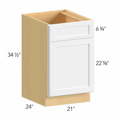



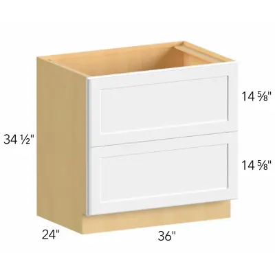


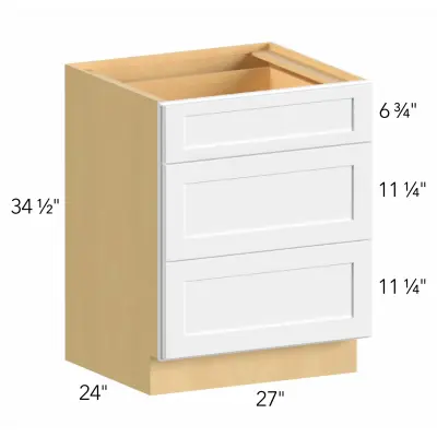


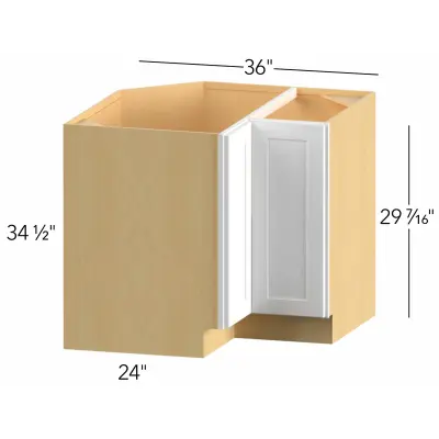


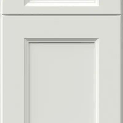

The right storage choice should bring warmth, structure, and daily function into the room without making the space feel heavy. Good planning looks at finish, grain, box quality, hardware, lighting, and how the whole layout will be used in the home.
What Are Wood Kitchen Cabinets and Why They Stay Popular
A kitchen with wooden cabinets often feels settled because the surface has depth instead of a flat printed look. Grain, tone, and finish create small variations that make a room feel more personal.
A wood cabinet for kitchen planning should be reviewed by touch as well as by color. Open the drawers, look at the edges, check the shelves, and notice how the finish responds to light. A display piece can look calm from a distance but feel too busy once repeated across a full wall.
Kitchens with wooden cabinets can suit older houses, new builds, and transitional interiors when the palette is handled carefully. The aim is not to match every surface. It is to let storage, counters, hardware, lighting, and flooring sit together without one element fighting the others. That is why kitchen wood cabinets are usually selected only after the wider room plan is understood.
Solid Wood Kitchen Cabinets vs Wood Veneer and Other Options
This choice is less simple than it sounds. Some buyers hear one phrase and assume it always means better quality, but construction matters more than the label alone. A strong box, accurate joinery, smooth drawer movement, and a well-applied finish can make a major difference in daily use.
A surface layer over a stable core may be useful when the owner wants consistent grain or better control across wide panels. The thin face layer still needs careful edge work, and the core should be strong enough for long-term use.
|
Choice |
Where it can work well |
Detail to check |
|
Solid parts |
Long-term value and repair potential |
Movement, finish, humidity response |
|
Surface layer |
Consistent grain across wider panels |
Edge treatment and core quality |
|
Painted finish |
Cleaner color schemes |
Touch-up needs over time |
|
Stained finish |
Visible grain and warmer tone |
Variation between pieces |
Small details deserve attention before a final order is placed. Check whether end panels are finished, how corners are solved, where fillers will be used, and whether handles feel comfortable from a normal standing position. These points rarely look important in a catalog, yet they affect the finished room every day. A beautiful finish can be undermined by poor spacing, awkward reach, or a drawer that cannot open fully beside an appliance.
maple wood for kitchen cabinets is often selected for a smoother grain and a lighter appearance. It can feel clean without looking sterile, especially when paired with simple handles and a calm counter surface.
Natural Wood Kitchen Cabinets for Warm and Timeless Interiors
kitchen cabinets natural wood can soften a room that has stone, metal, glass, or strong overhead lighting. The effect comes from tone and grain rather than ornament.
Lighter finishes tend to keep a room open. Medium brown tones can feel steady and practical. Deeper stains may look rich, but they need enough daylight or layered lighting so the room does not become visually closed.
Use this quick review before choosing:
-
place the sample flat and upright
-
compare it with the counter surface
-
check it beside the floor choice
-
view it under warm and cool light
-
look at grain direction on drawers
-
decide where the pantry section should sit
A calm selection often lasts longer visually than a dramatic one. If the surface already has strong grain, keep nearby finishes quieter. If the rest of the room is plain, a little movement can add needed warmth. The finished space should look lived-in, not staged for one photograph.
Modern Wood Kitchen Cabinets for Contemporary Kitchen Design
Cleaner interiors usually depend on proportion more than decoration. Flat fronts, slim pulls, matte finishes, and steady grain can make the room feel current without making it cold.
A contemporary plan may use warm oak, pale tones, or deeper brown finishes with simple hardware. The balance comes from restraint. Too many contrasting finishes can make the room feel chopped into pieces, especially in an open layout.
Before placing an order, compare the sample with:
-
wall color
-
appliance finish
-
counter pattern
-
floor tone
-
handle shape
-
lighting under the wall units
A shade that looks perfect alone can shift once it sits beside a bright counter or cooler floor. This is why a physical sample is more reliable than a screen image. It also gives a better sense of texture, which is difficult to judge from a small online picture.
Best Wood Kitchen Cabinets for Style, Durability and Daily Use
Daily life should guide the final decision. A busy family may need easy-clean fronts, strong drawers, quiet hinges, and finishes that forgive fingerprints. A quieter household may care more about grain depth, furniture-like detail, or a softer hand-finished look.
real wood kitchen cabinets can age well when the finish suits the room and the care routine is realistic. all wood kitchen cabinets may sound like a simple promise, but the product should still be reviewed part by part: boxes, shelves, drawer systems, fronts, hardware, panels, fillers, and finish quality.
Ask these questions before approving the order:
-
Do the drawers feel steady when loaded?
-
Will the finish handle regular wiping?
-
Is the tone flexible if paint or counters change later?
-
Are panels, fillers, and end pieces included?
-
Does the storage plan fit daily cooking habits?
-
Is there enough space near appliances and corners?
A good layout should not only look attractive in photos. It should make plates, pans, food storage, and small appliances easier to reach. The door profile also matters: a raised shape can feel classic, while a flat face gives a cleaner line. This is where product selection and room planning meet.
Visit Our Showroom to Compare Wood Cabinet Samples
Kitchen and Floor Decor helps homeowners compare finishes, hardware, counters, flooring, and display layouts in person. The showroom includes samples and real kitchens inside the space, making it easier to judge color, scale, and texture before ordering.
Bring measurements, photos, appliance notes, and a short list of priorities. A consultant can help narrow the choice, explain finish differences, and review remodeling and installation details before the plan moves forward.
In-person comparison is useful because grain is difficult to judge online. A finish may look warm in a photo but turn orange beside the counter. A pale tone may look fresh on a screen but feel too washed out under strong lighting. Seeing pieces side by side prevents many expensive guesses.
A complete plan should include product choice, measurements, finish notes, hardware, accessories, timing, and fitting details. When those points are clear, the finished space is more likely to feel balanced, useful, and connected to the rest of the house. It should support daily routines, suit the home, and still feel right after the first excitement of choosing finishes has passed.


